My College Magazine is called 'College life'. My front cover
develops forms and conventions of real media products, as I included a
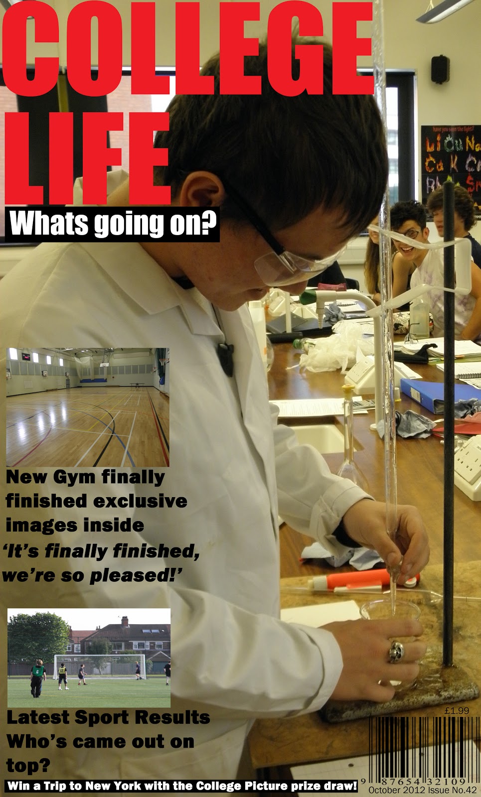
Masthead, Sell line, Price, Date, Barcode, Feature lines, Images, Issue Number
and an advertisement/Offer. I've worked around my Front Cover thinking of my
Target Audience which is College students, I thought about what would appeal to
them best and draw them in. To do this I took images they can relate to for
example, my image used as a background for my front cover, is a student working
in a science lab, which all the students reading my magazine will have done in
school. I also included Sport images and feature stories to attract the sporty
age range that may read this magazine for the 'Latest Sport results'.
I attracted my pacific target audience by adjusting the
conventions of my magazine to suit them. For example, My Masthead 'College
Life' obviously relates to them as they are all in College. The bold red font I
chose to use is really eye catching, it will be sure to grab student’s
attention and draw them in. My selling line 'What’s going on?' is a rhetorical
question, my audience will want to know what’s going on in their college so
will pick up the magazine to find out. This Sell line is also in a bold font with
a graphical shape highlighting which makes it stand out even more, with the
strong contrast between the white text and the black graphical shape behind it.
My Feature stories are based on topics I think my Target Audience will be
interested in for example the Latest Sport Results, will surely interest the
students of this college, as they will want to support their college teams and
find out what’s going on with them. My other feature story about the new gym
includes 'exclusive images' this is sure to draw the sport audience in, as they
will want to see their new gym. My front cover includes a barcode, the date,
issue number and also price which are all conventions of a magazine. I included
an advert which is 'Win a Trip to New York' which I also used a black graphical
shape to enhance the white text.
If I had the chance to make my College Magazine front cover
again I would, include more feature stories, with a wider variety of different
topics as the only topics I really have are sport which won’t appeal to all
students reading this magazine. I would also shorten the Feature Story text, as
shorter 'snappier' text is more interesting to read and get the point across
quicker. I would also change my Advert slightly by adjusting the word 'win' as
when the audience see this they will surely want to read more.
I have definitely progressed in my Photoshop skills during
this project. For example, the quick selection tools, the character tool to
produce my text and also the transform/rotation tools.
No comments:
Post a Comment