
When I first started to construct my front cover of a
College Magazine I concentrated on my Masthead a lot by trying out different
fonts, sizes and layouts. I realised the layout of this Masthead I tried out didn’t
quite work, as it isn’t really a conventional feature as the Masthhead is
usually central at the top of the page. It also wasn’t quite bold enough, to
really draw in the audience. So I developed my Masthead to get to my final one
which is shown below.
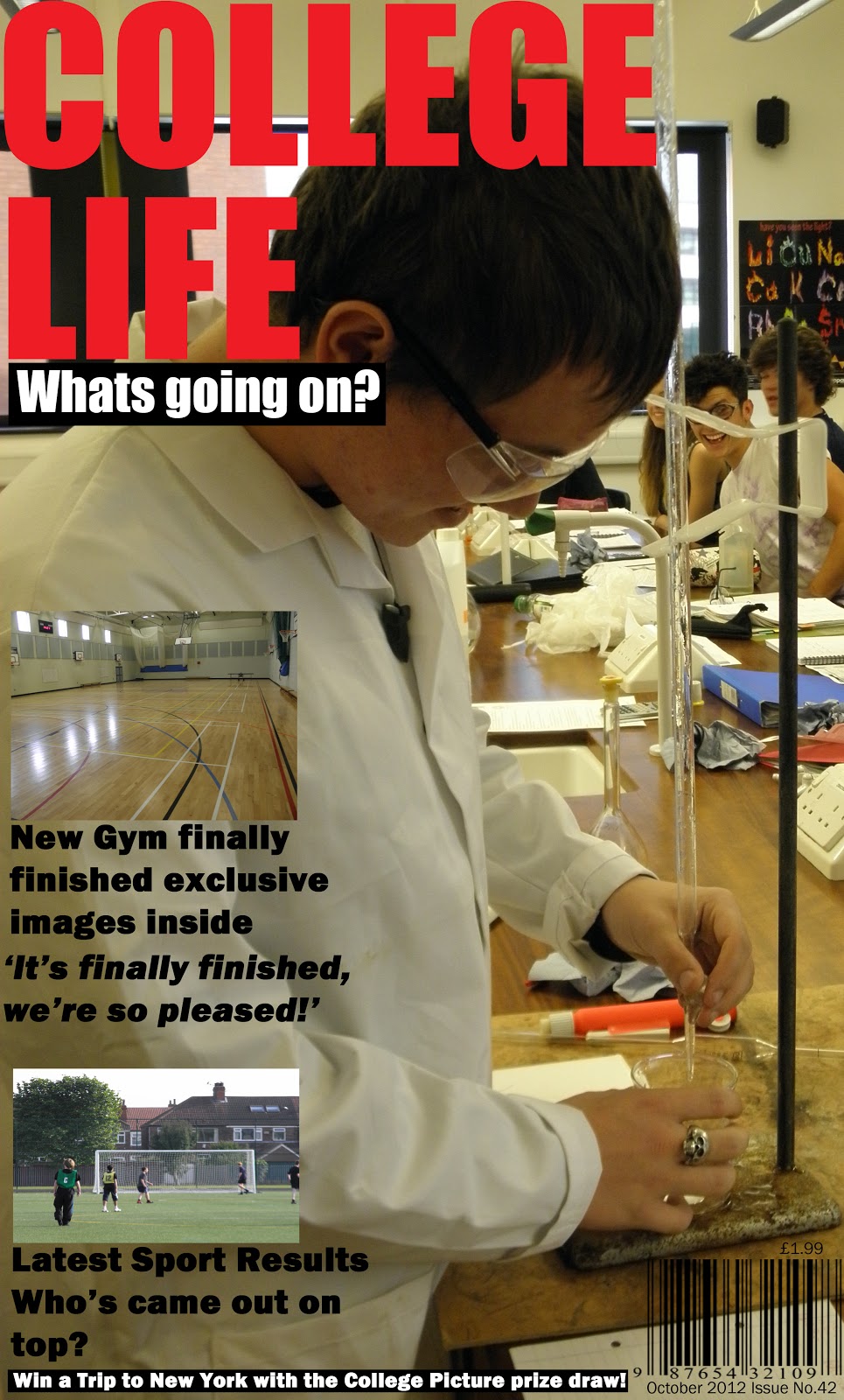
This Masthead is much more effective as its bolder and brighter, which will draw in the audience a lot more successfully. I also think this Masthead look a lot more professional, overall it works better with my front cover.
No comments:
Post a Comment