In what ways does your media product use, develop or challenge forms and conventions of real media products? Step 1


I chose the genre Hiphop/Rap to base my magazine around. I know this genre of music will attract a teenage audience. I used a house style format for my magazine front cover, contents page and double page spread because this is a main convention of a magazine. To create the house style I used the same colour scheme throughout, which is Red, white and black with a grey background. I used the red for my mastheads ‘HHR’ and ‘Massi’ and also other text that I wanted to stand out, for example main cover lines and feature sections. I used the same fonts throughout these three pages. ‘Impact’ for most of it as it’s a bold font, it stands out I think represents the genre of music I based my magazine on. I also used the font ‘Calbri’ for the editors section, facebook and twitter web addresses on my contents page. I also used ‘Calbri’ for the answers from Massi’s interview, I used this font for these few things as its more simple and makes these bulks of test easier to read.
The images I took of my ‘artist’ and used I made to also work with the house style by dressing him in colours that I used for my house style format. For example the black shirt and red hat he is wearing. I made sure my double page spread page numbers match the page numbers on my contents page feature section and I also used the same artist on my front cover and double page spread as he’s the artist this week’s magazine is featuring. I looked at other magazines front covers, contents pages and double page spreads and analysed them before doing my own. I picked out the conventions they included, so I could then include them in mine.
Step 2
How does your media product represent particular social groups?
When I first started to look into what type of audience I
wanted my magazine to target I thought about the genre of music my magazine was
going to contain. As I decided on Hiphop/Rap as my genre I put together a
reader’s profile which included images and statistics I thought would fit my
magazine. The images I collected were of artist that create music that fit into
the Hiphop/Rap genre, the type of clothing the target audience my magazine
would wear and their interests. From these images I decided that the best age
of my target audience would be teenagers/ young adults. As this is the type of
clothing and interests a lot of teenagers wear and have today. For example fast
food, Hiphop/Rap artists/music, designer clothing such as Nike, social
networking sites and statement jewellery. I then looked further into my social
group and decided they will be male and females of the ages 15-24, middle class
and either still in education, a part time job or an apprentice. By looking at
my reader’s profile and also my social economics table.
I looked at artists that are featured in the Hiphop/Rap
magazine ‘XXL’ so I had an idea of which artists to feature in mine, which
would attract my target audience. I also thought about how much my target
audience uses social networking sites such as Facebook and Twitter, so I
decided to put Facebook and Twitter links for my magazine’s pages on the
contents page of my magazine. The mise-en-scene of my magazine was a really
good way to represent stereotypes and the age group I was trying to attract, by
the use of bright, bold colours, lots of Hiphop/Rap artists and also plenty of
images in my magazine. I also used these three elements to create my magazine
as when I made a focus group by asking a group of people question on what
attracted them to a music magazine. They said that these three things attracted
them to a magazine the most. The artist I decided to use in my magazine are
major artists that influence their target audience such as Eminem, Drake and
Jay Z. I used these artists as they are well known and would really attract my
target audience.
What kind of media institutions might distribute your media product and why?
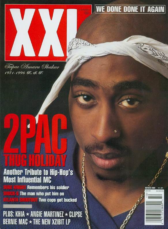
The magazine ‘XXL’ inspired my own magazine ‘HHR’. I looked at many of XXL’s front covers, the layout and the artists this magazine features. I found that this magazine was based on the Hiphop/Rap genre. I knew this from the artist XXL features, for example 2Pac, Lil Wayne, 50 Cent, Jay Z and Kanye West. XXL magazine is published by Harris Publications , Vanessa Satten is the editor-in-chief.
I was attracted to XXL magazine by the colours used red and white which stand out against the dark background. I was also attracted to this magazine because of the large image. The accessories 2Pac is wearing in this image connotes Hiphop/Rap artists as he’s wearing a large gold chain, a stud in his nose and a bandana. This is where I got my costume ideas for Massi.
Who would be the audience for your media product?
How did you attract your audience?
The house style my magazine uses will appeal to my target audience
as the red I have used for my mastheads, feature stories and quotes will grab
their attention making them want to read on. I have used lots of images on my contents page
as I know images are one of the elements that attract my target audience most. I
made sure I used a range of different people as I was taking photographs for my
magazine pages. The image on my front cover is a large image which fills most of
the page, it has got colours I have used to create my house style and it’s an
interesting image that has connotations of Hiphop/Rap artists. This will
attract my target audience as I found from my videoed focus group, images play
a huge part in attracting my audience to a magazine. The font I used for main
text on my magazine ‘Impact’ is a large bold font that stands out, this will
catch the eyes of my audience making them want to read what’s inside. This font
I used also connotes the genre of music my magazines based on in my eyes, as it’s
big and bold like the genre Hiphop/Rap.
At the bottom of my contents page I put the logos of social
networking sites Facebook and Twitter with addresses to my magazines pages for
these. This will attract my target audience as I found out while videoing my
focus group. I produced my magazine around the target audience I was determined
to attract. So I used the language I thought was appropriate and my audience would
relate to throughout my magazine pages text for example my double page spread interview
to make my audience feel part of the scene. I also thought about my costume and
prop choice before I took photographs of people for the artists for my
magazine. I used just basic clothing eg jeans and t-shirts but added props eg statement
jewellery (gold chains) and snap back hats to also relate to my audience as I
know this is the type of clothing they also wear.
Audience Feedback
I wrote out six questions that I wanted to ask people about my magazine:
- What genre of music do you think this magazine contains?
- Can you identify the conventions used? If so which ones?
- Do you think the price of the magazine is reasonable?
- Has a house style been used? If so, how can you tell?
- Can you identify the target audience?
- Are there any changes you could make? If so,what?
Six people from my media class answered my questionnaires, the feedback I got provided me with the information I needed to see if the conventions and house style I used were noticeable, my target audience was noticeable, the genre of music my magazine included was noticeable and if the price I made my magazine was reasonable or not. The feedback from my last question allowed me to improve my magazine pages.
The feedback on my first five questions was all really positive. The genre of music my magazine, my target audience, house style and conventions I used was noticeable. The price I decided on for my music magazine was said to be reasonable. My last question provided me with feedback such as:
- Add more Images
- Use different people for more images
- Change the font layout
- Space the front cover text out more
I looked back at my magazine pages and added certain elements such as more images and anchorage and changed the layout slightly by moving text and certain conventions to make more room on my front cover and contents page.
My original front cover, contents page and double page spread:
My improved front cover, contents page and double page spread:
Videoed Audience Feedback:
From think feedback I found that:
- The images I used, colours and text represented the genre hiphop/rap well
- The conventions I used on my magazine pages were recognizable
- The age range I chose for my audience was recognizable
- The images I chose grab my audience attention
I also found that the genre I chose to base my music magazine around (hiphop/rap) could maybe be recognized as RnB by an audience that is not really familiar with the hiphop/rap genre.
What have you learnt about technologies from the process of constructing this product?
I have learnt a range of different skills on Photoshop which I used to create my music magazine pages. Such as:
Which I used to select the person I had taken a photo of to then put the selected image onto a background a wanted eg a plain black background.
Which I developed my knowledge in, I was able to find more fonts that suited the genre of my magazine. I looked at a lot more different music magazine to develop my knowledge of the correct layout to then create my magazine pages. I used different font styles depending on the text eg a simple font for price.
I was able to duplicate certain layers to then change the levels of my images I took to make them more professional looking.
I have developed in my knowledge of conventions that music magazines include, such as:
- Skyline
- Footer
- Issue number
- Cover date
- Encourage
- Developed Pull quotes
I think I've developed in the whole layout of my magazine by looking at different music magazines and identify the conventions they include and where abouts they are placed on the magazine pages. Using as many of these conventions as I could in the right place helped me to create a more professional looking magazine. Compared to my preliminary task my music magazine front cover images and text really stand out due to the background I chose to use. Looking back at the preliminary task I can now see that I should have quick selected the image of the person I chose to take a photograph of and put it onto a plain background so the main image and the images for the feature stories would have stood out more.
If I could change anything on my music magazine front cover I would maybe lighten the background slightly to make it a more grey colour so my main image stood out even more. I wold also add more feature stories to my front cover and spread them out so they're on both sides of the page, not just the left side. This would make my magazine seem a lot more interesting and look as if its packed full of hiphop/rap related information. It was useful to carry out the preliminary task as this was a starting point, I learnt a lot of basic Photoshop skills which I was able to develop as I made my music magazine pages. The preliminary task also taught me all of the conventions a magazine included and why they were included. This helped me a huge amount when I came to make my music magazine.


.JPG)


